
This is a text automatically translated from Italian. If you appreciate our work and if you like reading it in your language, consider a donation to allow us to continue doing it and improving it.
Content index
As you know, environmental pollution, also caused by the internet, is a topic that interests us greatly and is close to our hearts. In the past we have addressed the topic by talking about Internet CO2 emissions and if you remember well we have already met electricityMap on multiple occasions. One is precisely the one in the article on CO2 emissions, the other is in the article Wasting time online: part five.
•After having already talked about it in a simple and quick way, we decided to dedicate an entire article to this beautiful project. In short: electricityMap it's a interactive map where you can see a carbon intensity rating of electricity consumed by states that release the data publicly!
As you may have already guessed this is a project Open source 1 well supported by the community: it has well over 1700 collaborators from 80 different countries 2.
electricityMap
As we said, this is a real-time interactive map of the greenhouse gas footprint (in terms of CO2 equivalent) of electricity consumption in the world. At a glance you can easily see which countries are making the most efforts to reduce their environmental impact.

In fact, the colors are not random but are based on the recorded carbon intensity, the percentage of low emissions (renewable and nuclear) or only renewable energy.
Within the map you can also see with extreme simplicity the import of energy (green or otherwise) and the export of energy.
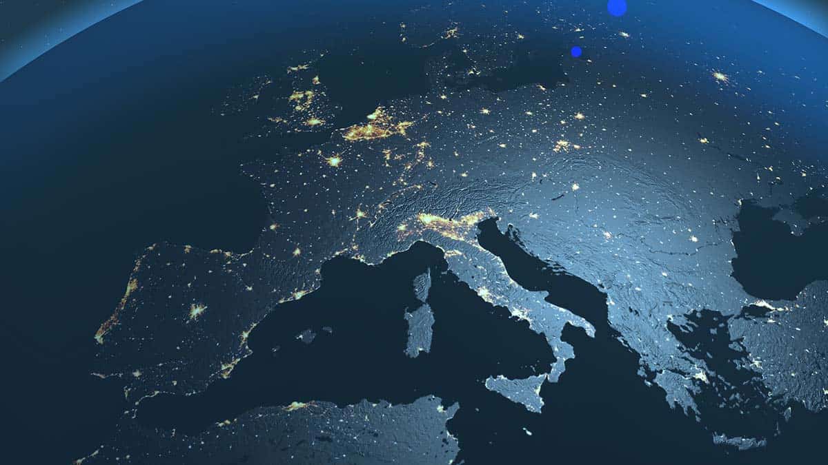
Italy and other states
From the map it seems to be quite clear, unfortunately, that Italy still has a lot of work to do, especially with regards to the Islands and the South. In the north and central-north things are slightly better also thanks to the nearby borders which export green energy.
By clicking on each state you can find out in detail where the energy produced comes from.
Unfortunately, as you can see, not all states declare their data publicly, in fact all the gray areas do not have data available. Europe is certainly an example when it comes to data transmission and transparency. Asia, Africa and the Middle East, however, are decidedly less successful, where very few states release public and analysable data.
•Join communities


If you have found errors in the article you can report them by clicking here, Thank you!